引言
在当今数字化时代,网页设计不仅需要具备美观的视觉效果,更需通过先进的技术手段提升用户体验。《智慧启迪》网页以视差滚动技术为核心,融合风险管理与合规科技的专业理念,打造出一个前瞻性与温馨人文并存的互动平台。本文将深入探讨CSS3在此设计中的应用,揭示背后的技术细节与实现之美。
视差滚动的实现
视差滚动通过不同层次的背景与前景元素以不同的速度移动,营造出深度感与动感。本设计采用纯CSS3技术实现视差效果,避免了复杂的JavaScript代码,提高了网页的性能与响应速度。
          /* 基本视差效果 */
          .parallax {
            /* 设置背景图片 */
            background-image: url('background.jpg');
            /* 固定背景,使其在滚动时不移动 */
            background-attachment: fixed;
            /* 背景覆盖整个容器 */
            background-size: cover;
            /* 背景位置居中 */
            background-position: center;
            /* 设置高度 */
            height: 100vh;
          }
通过上述CSS代码,背景图片在用户滚动页面时保持固定,前景内容则以正常速度移动,从而形成视差效果。这种技术不仅提升了视觉层次感,还增强了用户的沉浸式体验。
第一部分:科技感设计
第一部分采用冷色调(如深蓝#0E2F44与灰色#353C4E),辅以亮绿色#7ED321点缀,营造出现代科技感。通过抽象几何图形与3D插画,强调品牌的前瞻性与专业性。
色彩与几何图形的运用
          .tech-section {
            background-color: #0E2F44;
            color: #FFFFFF;
            display: flex;
            align-items: center;
            justify-content: center;
            height: 100vh;
            position: relative;
            overflow: hidden;
          }

          .tech-section::before {
            content: '';
            position: absolute;
            top: 0;
            left: 0;
            width: 100%;
            height: 100%;
            background: linear-gradient(135deg, #353C4E 25%, transparent 25%) -50px 0,
                        linear-gradient(225deg, #353C4E 25%, transparent 25%) -50px 0,
                        linear-gradient(315deg, #353C4E 25%, transparent 25%),
                        linear-gradient(45deg, #353C4E 25%, transparent 25%);
            background-size: 100px 100px;
            z-index: 1;
            animation: moveBackground 10s linear infinite;
          }

          @keyframes moveBackground {
            from { background-position: 0 0, 0 0, 0 0, 0 0; }
            to { background-position: 100px 100px, 100px 100px, -100px -100px, -100px -100px; }
          }

          .tech-content {
            position: relative;
            z-index: 2;
            text-align: center;
          }

          .tech-content h2 {
            color: #7ED321;
            font-size: 3em;
            margin-bottom: 20px;
          }

          .tech-content p {
            font-size: 1.2em;
            line-height: 1.6;
          }
上述代码中,通过::before伪元素与linear-gradient结合,实现动态移动的抽象几何图形,增强科技感。动画@keyframes moveBackground则控制背景的移动轨迹,使整体效果更加生动。
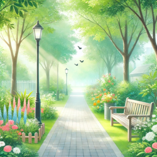
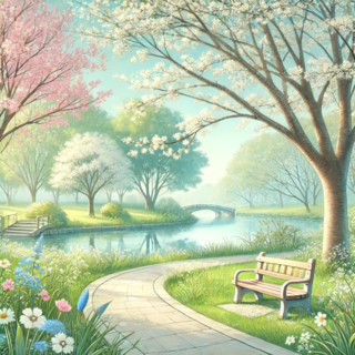
第二部分:温馨人文设计
第二部分采用暖色系(橙色#FF9900与黄色#FFE600),结合水彩风格插画与手绘字体,传递出温暖与智慧。从冷峻的科技感过渡到柔和的人文关怀,营造出品牌的多元化形象。
水彩背景与手绘字体
          .warm-section {
            background: #FF9900;
            color: #333333;
            display: flex;
            align-items: center;
            justify-content: center;
            height: 100vh;
            position: relative;
            overflow: hidden;
          }

          .warm-section::before {
            content: '';
            position: absolute;
            top: 0;
            left: 0;
            width: 100%;
            height: 100%;
            background: url('https://images.gptkong.com/demo/sample6.png') no-repeat center center;
            background-size: cover;
            opacity: 0.5;
            z-index: 1;
          }

          .warm-content {
            position: relative;
            z-index: 2;
            text-align: center;
            font-family: 'Lora', serif;
          }

          .warm-content h2 {
            color: #FFE600;
            font-size: 3em;
            margin-bottom: 20px;
          }

          .warm-content p {
            font-size: 1.2em;
            line-height: 1.6;
          }
在这部分,通过background属性引入水彩风格的背景图像,并使用opacity调整其透明度,使文字内容更加突出。同时,选用手绘字体,营造出温暖与人文的氛围。
第三部分:权威性与可信赖感设计
第三部分采用经典的黑白灰配色(黑色#1A1A1A、白色#FFFFFF),辅以深蓝#002366,凸显权威性与可信赖感。简洁而不失庄重,传达出专业与严谨的品牌形象。
经典配色与简约布局
          .authority-section {
            background-color: #FFFFFF;
            color: #1A1A1A;
            display: flex;
            align-items: center;
            justify-content: center;
            height: 100vh;
            position: relative;
            overflow: hidden;
          }

          .authority-content {
            text-align: center;
            max-width: 800px;
          }

          .authority-content h2 {
            color: #002366;
            font-size: 3em;
            margin-bottom: 20px;
          }

          .authority-content p {
            font-size: 1.2em;
            line-height: 1.6;
            color: #333333;
          }
干净利落的配色和简洁的布局使得内容更加易读,同时深蓝色的使用强化了品牌的权威性。通过max-width限制内容宽度,确保信息传达的清晰与有序。
固定导航栏与多语言切换
导航栏固定在页面顶部,保证用户在滚动过程中始终能够方便地访问各个部分。多语言切换功能则通过CSS3隐藏与显示不同语言的内容,提升国际化扩展能力。
固定导航栏的实现
          .navbar {
            position: fixed;
            top: 0;
            width: 100%;
            background-color: rgba(14, 47, 68, 0.9);
            display: flex;
            justify-content: space-between;
            align-items: center;
            padding: 20px 50px;
            z-index: 1000;
            transition: background-color 0.3s ease;
          }

          .navbar.scrolled {
            background-color: rgba(14, 47, 68, 1);
          }

          .navbar .logo {
            color: var(--accent-color);
            font-size: 1.5em;
            font-weight: bold;
          }

          .navbar .language-switch {
            display: flex;
            gap: 15px;
          }

          .navbar .language-switch a {
            color: var(--light-color);
            cursor: pointer;
            transition: color 0.3s ease;
          }

          .navbar .language-switch a:hover {
            color: var(--accent-color);
          }
通过position: fixed将导航栏固定在顶部,并使用rgba设置半透明背景,实现滚动时的视觉连贯性。transition属性则为背景色的变化添加了平滑过渡效果。
渐变对比与按钮交互动画
视觉焦点通过渐变对比色吸引用户注意。按钮在悬浮时触发轻微放大与颜色变换动画,提供互动反馈,增强用户体验。
按钮悬浮效果
          .btn {
            background: linear-gradient(45deg, var(--accent-color), #002366);
            color: var(--light-color);
            padding: 15px 30px;
            border: none;
            border-radius: 5px;
            font-size: 1em;
            cursor: pointer;
            transition: transform 0.3s ease, background 0.3s ease;
          }

          .btn:hover {
            transform: scale(1.05);
            background: linear-gradient(45deg, #002366, var(--accent-color));
          }
按钮使用linear-gradient生成渐变背景,transition属性控制缩放与背景色变换的动画效果,使互动更加直观与流畅。
模块化布局与网格系统
采用模块化布局,每一模块聚焦一个主题,通过CSS Grid系统保证结构清晰,与整体设计理念紧密契合。
CSS Grid布局示例
          .grid-container {
            display: grid;
            grid-template-columns: repeat(auto-fit, minmax(300px, 1fr));
            gap: 20px;
            padding: 50px;
          }

          .grid-item {
            background-color: #f5f5f5;
            padding: 30px;
            border-radius: 10px;
            box-shadow: 0 4px 6px rgba(0, 0, 0, 0.1);
            transition: transform 0.3s ease, box-shadow 0.3s ease;
          }

          .grid-item:hover {
            transform: translateY(-10px);
            box-shadow: 0 10px 15px rgba(0, 0, 0, 0.2);
          }
通过grid-template-columns实现响应式网格布局,gap属性控制网格间距。每个.grid-item模块在悬浮时增强视觉层次,通过transform与box-shadow创造出动感效果。
个性化仪表盘与互动教程
个性化仪表盘区域允许用户生成定制化报告,互动教程专区则提供学习资源。通过CSS3的Flex布局与动画效果,实现功能模块的灵活展示与交互。
仪表盘与教程模块布局
          .dashboard, .tutorials {
            display: flex;
            flex-direction: column;
            align-items: center;
            padding: 50px;
            background-color: #FFFFFF;
          }

          .dashboard h3, .tutorials h3 {
            color: #002366;
            margin-bottom: 20px;
            font-size: 2em;
          }

          .dashboard .report, .tutorials .lesson {
            width: 100%;
            max-width: 800px;
            background-color: #f0f8ff;
            padding: 20px;
            margin-bottom: 30px;
            border-radius: 8px;
            box-shadow: 0 2px 4px rgba(0, 0, 0, 0.1);
            transition: background-color 0.3s ease;
          }

          .dashboard .report:hover, .tutorials .lesson:hover {
            background-color: #e6f7ff;
          }
通过flex-direction: column实现垂直排列,模块间通过margin调整间距。悬浮效果通过背景色的变化,提供用户友好的互动体验。
页脚设计:返回顶部与滚动进度指示器
页脚部分包含返回顶部按钮与滚动进度指示器,提升浏览体验。返回顶部按钮通过固定定位与圆形设计确保易于访问,滚动进度指示器则实时反映用户的浏览进度。
返回顶部按钮与滚动进度条
          .footer {
            position: relative;
            background-color: #1A1A1A;
            color: #FFFFFF;
            text-align: center;
            padding: 30px 20px;
          }

          .back-to-top {
            position: fixed;
            bottom: 40px;
            right: 40px;
            background-color: #7ED321;
            color: #FFFFFF;
            width: 50px;
            height: 50px;
            border-radius: 50%;
            display: flex;
            align-items: center;
            justify-content: center;
            cursor: pointer;
            box-shadow: 0 4px 6px rgba(0, 0, 0, 0.3);
            transition: background-color 0.3s ease, transform 0.3s ease;
            z-index: 1000;
          }

          .back-to-top:hover {
            background-color: #005f2e;
            transform: scale(1.1);
          }

          .scroll-progress {
            position: fixed;
            top: 0;
            left: 0;
            height: 5px;
            background: linear-gradient(to right, #7ED321, #002366);
            width: 0%;
            transition: width 0.25s ease;
            z-index: 999;
          }
返回顶部按钮通过position: fixed固定在页面右下角,确保用户随时可访问。.scroll-progress条则以动态宽度展示用户的滚动进度,通过JavaScript动态控制其width属性。
综合布局与响应式设计
整个网页设计采用模块化与网格系统,结合Flexbox与Grid布局,实现各部分的灵活排布与响应式适配。CSS3的媒体查询功能则确保网页在不同设备上的一致性与可用性。
媒体查询示例
          @media (max-width: 768px) {
            .navbar {
              flex-direction: column;
              padding: 10px 20px;
            }

            .navbar .language-switch {
              margin-top: 10px;
            }

            .grid-container {
              grid-template-columns: 1fr;
              padding: 20px;
            }

            .btn {
              width: 100%;
              padding: 15px;
              font-size: 1.2em;
            }
          }
通过@media规则,调整导航栏布局、网格列数与按钮样式,确保在移动设备上依然拥有优质的浏览体验。
代码优化与性能提升
为了保证网页的高效运行,CSS3代码采用模块化与重复利用原则,减少冗余。同时,利用CSS变量(Custom Properties)提升代码的可维护性与灵活性。
CSS变量的应用
          :root {
            --primary-color: #7ED321;
            --secondary-color: #002366;
            --background-color: #0E2F44;
            --accent-color: #FF9900;
            --text-color: #FFFFFF;
          }

          .navbar {
            background-color: var(--background-color);
          }

          .btn {
            background: linear-gradient(45deg, var(--primary-color), var(--secondary-color));
            color: var(--text-color);
          }

          .btn:hover {
            background: linear-gradient(45deg, var(--secondary-color), var(--primary-color));
          }
通过定义CSS变量,在不同的部分统一管理颜色与样式,使得后续调整更加便捷,同时提升了代码的一致性与可读性。
总结
《智慧启迪》网页设计通过精心运用CSS3技术,实现了视差滚动、动态交互与多主题风格的完美结合。模块化与响应式布局确保了网页在各类设备上的出色表现,而细腻的动画与渐变效果则为用户带来了沉浸式的浏览体验。此设计不仅展示了前端技术的深度与专业性,更通过视觉与功能的融合,提升了品牌形象与用户满意度。